

I am designing the in-restaurant experience for the food ordering app.
The problem
"Many users are seeking a convenient and personalized way to order food that aligns with their individual preferences and dietary needs. Current food ordering apps lack a seamless and user-friendly interface for customizing menu items, and saving personalized orders.
The challenge is to design an exceptional user experience that addresses these needs and preferences, ensuring that users can effortlessly customize, save, and track their food orders, resulting in increased user satisfaction and engagement with the app."
Project duration:
May 2022 to June 2022
The goal:
The goal of this project is to design a user-friendly and intuitive food customization order app that allows users to easily customize, save, and track their food orders.

My role:
UX/UI designer designing an app for Click Lick Cafe from conception to delivery.
My responsibilities:
Conducting interviews, paper and digital wireframing, low and high-fidelity prototyping, conducting usability studies, accounting for accessibility, and iterating on designs.
User research: Summary
To kick off the project, I conducted user research to understand the target audience and their needs. Two primary user personas were identified based on my user research.


Health-conscious Users
-
These users are concerned about the nutritional content of their meals.
-
They often have specific dietary requirements or restrictions.
-
Value healthy and balanced meal options.

Food Enthusiasts
-
These users enjoy having control over their meals. Providing them with the option to customize their menu item and portion sizes will enhance their experience.
-
They want to easily modify dishes according to their taste preferences.
Defining Personas & Goals
Michael is a dietitian who needs the ability to customize menu items to fit his dietary


Ronke is a food blogger who wants an app with a wide variety of menu items and unique options.
Pain points uncovered
Customized menu
Users are been denied the restarant experience; being able to select menu items from the available menu.
Personalization
Most users want to personalize their menu items before completing their orders.
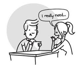
Re-ordering
Users want to save their favorite menu and re-order it in fewer clicks.
Refining the User journey
Mapping Michael’s user journey revealed how helpful it would be for users to be able to personalize their menu items.
![Click Lick Cafe app - user journey map [Henry Adeyemi].png](https://static.wixstatic.com/media/f3b192_beae83f67e0441049075bc35e40dd15b~mv2.png/v1/fill/w_939,h_524,al_c,q_90,enc_avif,quality_auto/Click%20Lick%20Cafe%20app%20-%20user%20journey%20map%20%5BHenry%20Adeyemi%5D.png)
Sketching a seamless user flow
I ensured the paths users take to complete the different tasks on the app are simple and easy. Unnecessary screens and duplications were deleted from the user's paths in achieving their goals.

Starting the design process
Paper wireframes
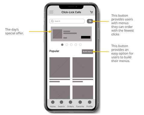
I first drafted iterations of each screen of the app on paper to ensure that the elements that made it to digital wireframes would be well-suited to address user pain points. For the home screen, I prioritized the build menu to help users who want that experience.


Digital wireframes
As the initial design phase continued, I made sure to base screen designs on feedback and findings from user research.
.png)
.png)
Insights from the first wireframe prototype usability study enabled me to iterate on the layout of the designs.
Low-fidelity prototype
Using the completed set of digital wireframes, I created a low-fidelity prototype. The primary user flow I connected was building a menu by selecting from the list of menu items which I used to conduct a usability study.

Usability study: Lo-fi prototype
I conducted two rounds of usability studies. Findings from the first study helped guide the designs from wireframes to mockups. The second study used a high-fidelity prototype and revealed what aspects of the mockups needed refining.
Affinity diagram
I gathered insights from the usability studies I conducted and organize the data. This helped me identify themes across the participants that I used to improve on the design.
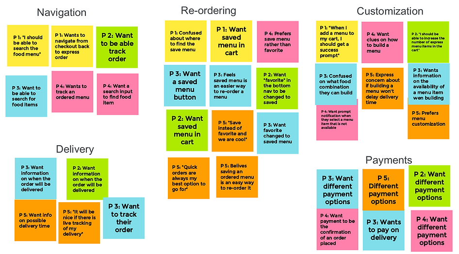
Usability study: Findings
Round 1 findings
-
Participants want updates on menu selection.
-
Participants want to track their orders.
-
"Build menu” functionality is confusing
Round 2 findings
-
Update on menu item selection provided clarity
-
Some participants want an express order
Refining the design
Early designs only update users on the type of menu items selected but after the usability studies, I added the number of portions at the bottom right of the menu items. This allows users two ways to stay updated while building their menu.
![Click Lick Café app - usability study - before and after [Henry Adeyemi].png](https://static.wixstatic.com/media/f3b192_0e6732baba8f4b5db8b41b0b37aa7ef4~mv2.png/v1/crop/x_0,y_4,w_554,h_468/fill/w_577,h_488,al_c,lg_1,q_85,enc_avif,quality_auto/Click%20Lick%20Caf%C3%A9%20app%20%20-%20usability%20study%20-%20before%20and%20after%20%5BHenry%20Adeyemi%5D.png)
![Click Lick Café app - usability study - before and after - 2 [Henry Adeyemi].png](https://static.wixstatic.com/media/f3b192_3c040a4497b04201a6eb09cccd4225f5~mv2.png/v1/crop/x_11,y_0,w_552,h_478/fill/w_563,h_488,al_c,lg_1,q_85,enc_avif,quality_auto/Click%20Lick%20Caf%C3%A9%20app%20%20-%20usability%20study%20-%20before%20and%20after%20-%202%20%5BHenry%20Adeyemi%5D.png)
The second usability study revealed congestion in the edit menu screen. This overwhelmed research participants. I simplified the screen by listing only the menu items in the selected food user wants to edit. This reduced number of licks and navigation for a smooth user experience.
Key mockups (Customize a menu)


Editing menu items on the click Lick high fidelity prototype app. Users can add or remove from the portions of each menu item. I ensure that the interface is simplified for the best user experience.
Key mockups (Build menu)


Building menu from scratch by selecting from the list of menu items. I designed this in order to put users in charge of what they want to order and how much of it the users want.
I ensure the navigation is simple to understand and motions are provided to enrich the user experience.


High-fidelity prototype
The final high-fidelity prototype presents user flows to build, edit the menu, and checkout. It also meets user needs to save a menu that has been customized and re-order.
.png)
Accessibility considerations
Provide access to users who are vision-impaired through adding alt text to images for screen readers.

Use detailed imagery for food and food items with to help all users better understand the designs.
Use icons to help make navigation easier.
Key Performance Indicators
In order to determine the success of these features, I am proposing to be added to food ordering apps. Below are the key metrics that I will be measuring, in addition to the normal food ordering process.
.png)
-
The number of menu items that users are customizing before placing the orders weekly.
-
The number of menu items users are building from scratch by selecting from the list of available menus weekly
Other metrics that I will be measuring, on the food order customization app in other to improve users' experience while customizing orders include.
-
Number of orders that users abandon while customizing menu weekly
-
Number of orders that users abandon while building their order weekly.
Design guide

Going forward
Takeaways
Impact:
The app makes users feel like Click Lick Cafe really thinks about how to give users the serving spoon.
One quote from participants' feedback:
"I enjoy the menu-building experience, it made me feel like I'm in front of the server in a restaurant"
What I learned:
While designing the Click Lick Cafe app, the importance of being opened-minded and receptive to new ideas. Usability studies and peer feedback influenced each iteration of the app’s designs.
Let’s connect!
Thanks for taking the time to review my work on the Click Lick Cafe app!
I love working on innovative design solutions and I am open to collaboration and opportunities to design more intuitive user experience products.
Do reach out!
